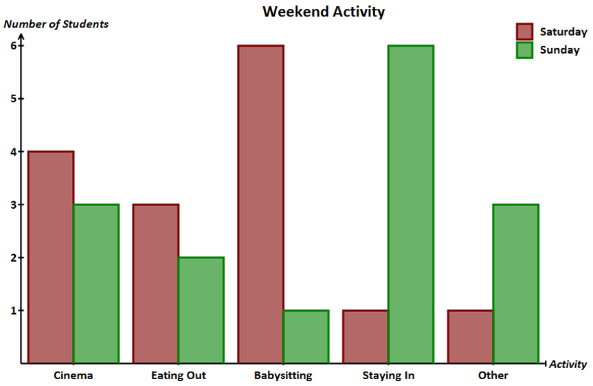
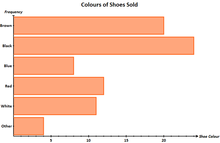
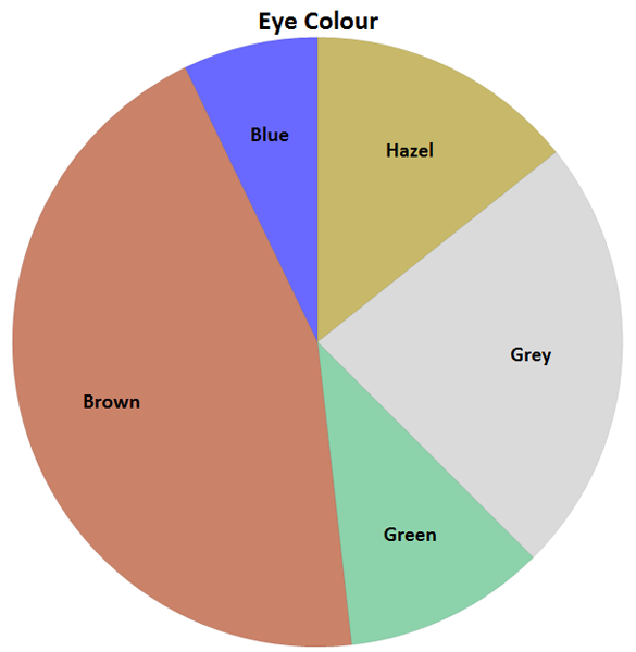
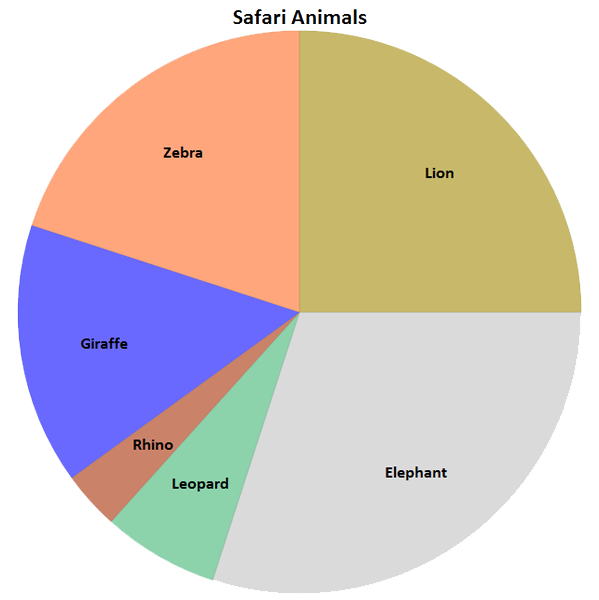
Pictograms (F)
Definition
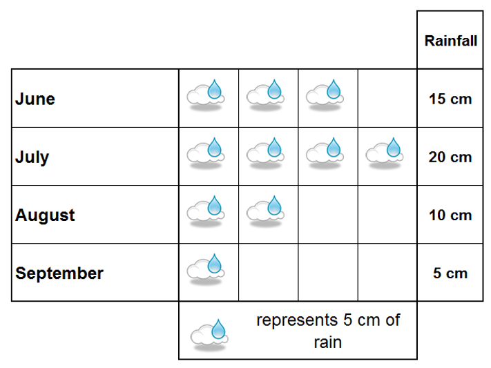
A pictogram is simply a way of portraying data using pictures. Usually a relevant symbol is used to represent the frequency of a particular item. Eg a single car symbol might represent 10 motorists. A symbol of a raindrop might represent 5 cm of rain. This information is shown in the 'key'
Diagram
Method
If you're drawing a pictogram, remember to include the key and to use a symbol that can be divided equally into parts (a circular symbol is particularly helpful)
Tips/hints
If you're reading data from a pictogram and the key isn't shown, you'll have to work out what the symbol represents using the information supplied.
Example
Italian restaurant owner Luigi is analysing the number of meals he sells each night. He's created the pictogram to portray this information. If on his busiest night he sold 50 meals, how many did he sell on his quietest night?
Diagram
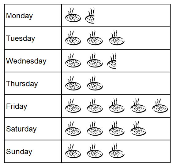
Solution
Looking at the pictogram, his busiest night is Friday. This has 5 pizzas representing 50 meals so each pizza represents 10 meals. The quietest night is the one with the fewest pizzas ie. Monday where there are 1.5 pizzas. So, this represents 1.5 x 10 meals is. 15 meals.